https://creativecommons.org/publicdomain/zero/1.0/https://www.rawpixel.com/image/2298579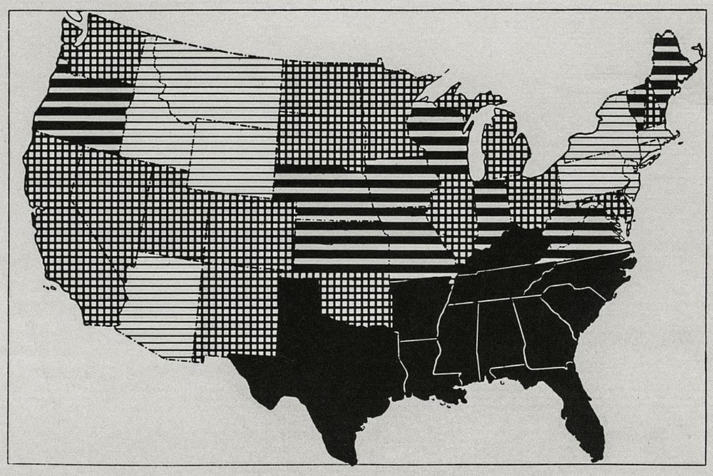
Map showing admission rates for measles by state, per 1000 per annum of white enlisted men in the United States from April 1917 to December 1919.
Solid black areas represent 50–116 per 1000 per annum. Heavy black areas represent 25–49 per 1000 per annum. Checkerboard areas represent 10–24 per 1000 per annum. Light barred areas represent 516–999 per 1000 per annum. Original image from National Museum of Health and Medicine. Digitally enhanced by rawpixel.
Public DomainFree CC0 image for Personal and Business use