Seeing Red
Prepare for a rant.
Once again, it's a lame mobile shot. This 365 really is pretty weak, and I do apologise. But that's not what the rant is about.
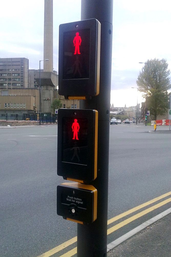
These crossing are springing up everywhere. They differ from the conventional design in that the red/green man indicator is mounted low on the pole and pointed parallel to rather than perpendicular to the road.
This means that instead of looking across the road to see if you can cross, you're looking down at your elbow.
When you're looking down you can't monitor what the traffic is doing. When more than one person wants to use the crossing the indicator becomes hidden behind the first person and invisible to everyone else.
The second you step off the crossing you can't see the indicator.
Because the indicator is close to the pedestrian they have to duplicate it with a high/low unit for kids and wheelchair users.
These things are just disastrous in every regard. Why, oh why, oh why replace a long established and massively effective design with a hugely inferior one.
Somebody, somewhere must think it's a better/safer/more efficient design. Who? Why? How? Are there Razzies for the design world? If so I'd nominate these bastards in a heartbeat.
Rant over. Original public domain image from Flickr