Make it
Yours.
Yours.
Edit, remix and personalize with your own text
Or start from these designs
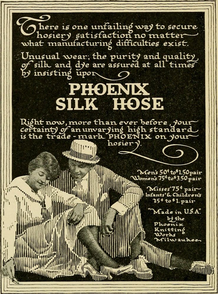
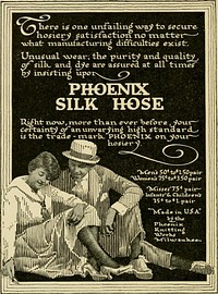
Identifier: typographyofadve00farr (find matches)Title: The typography of advertisements that pay : how to choose and combine type faces, engravings and all the other mechanical elements of modern advertisement constructionYear: 1917 (1910s)Authors: Farrar, Gilbert Powderly, 1886-Subjects: Advertising Type and type-founding TypesettingPublisher: New York London : D. Appleton and companyContributing Library: Duke University LibrariesDigitizing Sponsor: Duke University LibrariesView Book Page: Book ViewerAbout This Book: Catalog EntryView All Images: All Images From BookClick here to view book online to see this illustration in context in a browseable online version of this book.Text Appearing Before Image:n in the cut being madefrom this copy and produces a calico effect, whichis a good point to remember in sending copyto an engraver. I believe, however, that thereader will be able to distinguish the differentmethods. The Burnett Vanilla advertisement is a com-bination halftone—part halftone and part linecut all in one plate. This entire advertisement isan excellent example of the Forceful Educationalstyle. The pictures, the lettering and the arrange-ment are all in excellent taste and the message isclear cut and convincing. The Phoenix Silk Hosiery advertisement is alsoa combination halftone. The faces, feet andhands are in halftone, the rest is line work. Aregulation black and white drawing of the letter-ing is made and the engraver makes a positiveinstead of a negative which produces white onblack instead of black on white. Black backgrounds, unless the lettering is pro-portionately large, will be hard to read. Any-thing hard to read may be pretty but it is seldomgood advertising.Text Appearing After Image:CrkmirkVt SPORTSMANS V>
Original public domain image from Wikimedia Commons
Public DomainFree CC0 image for Personal and Business use
MonthlyYearlySave 50%
Get Premium
Professional design resources and creative tools
from
from
$
6.50
/mo
$78 billed yearly
- Unlimited downloads
- Ad-free experience
- Unlock millions of creative assets and our entire Creative Studio of editable templates, mockups and design tools